
 Dan Steen
We just launched our quiz, 'How prepared are you for a bushfire?', the other week. I wanted to give some background about the design and visual development process we took in articulating our archetypes.
So much bushfire imagery in the media and online is focused on either the emergency services themselves or the catastrophic event unfolding. This imagery is provoking and powerful, however, it's not entirely approachable for those who have experienced a catastrophic event before.
The challenge we faced when creating the imagery for ClimateThrive was how we might make the visual representation of the archetypes accessible, non-threatening and representative, without isolating our users. This is why our branding is consciously hopeful with its bright green hue. The logo itself represents the re-growth of bushland after a devastating event and the resilience of communities in their recovery journey.

My background is actually in 2D animation and design, which is a blessing and curse. It means I am often tempted to design and animate things myself rather than outsource, and as any animator knows, it's a long and arduous process. Although I was a little rusty, I was excited to get my hands dirty and get back into illustrating and designing.
To solve the challenge I utilised several different tools in my designer toolkit. Firstly, we followed a design thinking approach, taking empathy-driven insights from our community survey. Responses highlighted deficiencies and lack of personalisation in the resources within communities at the time. We defined this as a unique challenge for us to address and came up with a number of different ways to solve this. These early ideas were mocked up and tested until we landed on a style that worked.
We also conducted rapid research around the imagery in the domain of preparedness and bushfires. We tried to identify a visual gap around what might stand out to our audience.


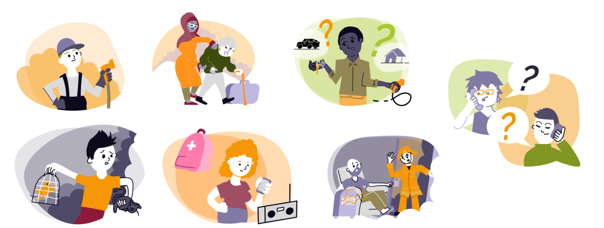
I utilised Scott McCloud's Big Triangle to experiment with where our archetypes should sit in terms of resemblance, meaning and abstraction. We ended up settling on placing our designs in between the abstraction and resemblance trisections. This was to make them easy to visually read and it allowed users to see themselves in the imagery without being too pictorial.

The communities we're targeting are diverse with their own unique cultures, demographics and backgrounds. Where possible we incorporated a mix of gender, age, culture and accessibility in archetype imagery while trying to avoid being tokenistic. This is something we're hoping to expand on as we further co-design with other communities.
Absent from our designs is dedicated image sets of Indigenous communities. This is something we want to collaborate with an Indigenous artist on and co-design with the community. If you or someone you know is an artist who might be interested in helping translate some graphical elements to be more inclusive, do get in touch!
The imagery is pretty low fidelity in terms of details. This is intentional so it would be easy for community members to see themselves and others in the imagery. Think of an emoji and how you can see your own and others' expressions in them when compared to a photo of someone you don't identify with.

Another aspect of the imagery was that it needed to be quick to produce with our limited time as a lean organisation of three people. It needed to translate to other visual storytelling mediums.
At ClimateThrive, we're developing animated sequences, motion graphics, illustrations, e-learning packages and comics that demonstrate critical stories, concepts and learnings to help individuals and communities be more prepared.
We tested our product with stakeholders in the emergency space, community members and people from a variety of backgrounds, locations and demographics.
We conducted user testing using a simple Figma prototype, but where possible we did try to incorporate real graphics and imagery to not just test functionality and concept, but also the visual appeal and approachability.
Overall, we were pleased to find that the imagery tested well. It was non-offensive, relatable and clear to our users. Some did not test well and those images were replaced and modified, which again was a great outcome. We simplified some imagery to have less detail to be more readable visually at a distance or on a smaller screen. This cleaned up our pages and gave the whole experience a more coherent and fun look.
The choice in scenes and scenarios were based on the archetypes' decision point of 'stay or go' and what their behaviour might be. Rachael and Danielle translated Ken's research into tangible ideas to turn into graphics.
As you can see below, I started with super simple pencil sketches and refined these based on the feedback from Danielle and Rachael.

Ultimately I was pretty happy with the visuals of our initial launch. I'm excited to have established a visual language that we can use for all our visual outputs going forward. I'm particularly excited about animating my first scene with these characters and developing further characters that reflect our diverse communities.
To see these graphics in practice visit our 'How prepared are you for a bushfire?’ quiz, and if you're looking to create engaging, visual and interactive experiences for your community, reach out directly to us at hello@climatethrive.com.au